Campus wayfinding: nine decisions before the map is drawn

Most universities, schools and colleges start a wayfinding project wanting a better-looking map. They finish it having considered nine key issues about access, privacy, behaviour and safety that weren't originally on the agenda.
The floorplan was never meant to be a map
Most campuses already have a floorplan. It was usually drawn for another purpose, as an estates record, an architect's plan or a fire drawing, and then pressed into service as the map because it was the only picture of the building anyone had. It describes the building faithfully; it was simply never designed to help someone move through it.
That distinction is easy to miss until an institution decides to replace the PDF with something digital. The drawing itself turns out to be the easy part. The real work is a set of decisions about who should see what, who is allowed where, which routes you'd rather people took, and what the map should do on its worst day.
Those decisions tend to arrive in a particular order. Here are nine issues we regularly see crop up in our conversations.
The people asking for directions aren't who you expect
The instinct is that wayfinding is for visitors. On a campus, visitors are usually the smallest group. The people asking are students in their first few weeks, students in week eleven who have just been timetabled into a different wing, and staff who have never had a reason to go to the fifth floor.
Listen to the questions and two different problems emerge. "Where's my seminar room?" is a directions problem. "I didn't know we had one of those" is a discovery problem, and it comes up just as often.
A map that only answers the first leaves half its value on the table.
Thresholds, elevators (lifts) and who's allowed where
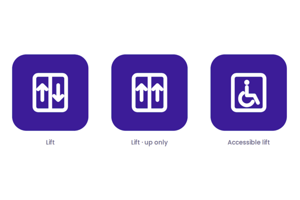
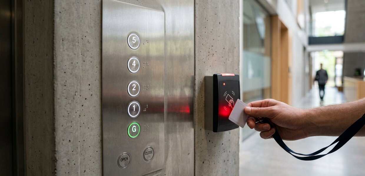
Real buildings have access-controlled corridors. They have lifts that don't stop at every floor, floors that belong to a different department with their own front door, and spaces students can reach that the public can't. None of that appears on a flat floorplan.
A route is only a good route if the person asking can actually walk it. Send someone confidently to a door they can't open and the map has done the opposite of its job. So routing has to understand permissions as well as geometry: who is asking, what they can open, and where the map should quietly route around.
Finding things, not just places
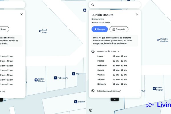
Every campus has invested in things nobody can find. Accessible and single-occupancy toilets. Quiet rooms and prayer rooms, welfare and first-aid spaces, defibrillators, and the informal study seating someone created out of a bay of old lockers.
A searchable map makes the building's offer visible to the people it was built for. Type "defibrillator" or "quiet room" and get an answer, rather than hoping the person on reception knows. This is where estates and student experience meet, and it's usually the moment the project stops being about maps.
One building, many publics
A single building serves a surprising number of audiences. Term-time students, evening and short-course learners, staff, visiting academics, guests at an event in the hired auditorium, and members of the public cutting through on a busy day in the neighbourhood. Each of them needs a different amount of the building.
Some should see every room on their floor. Others should see a lift and a label, "this one takes you to the conference suite", with no interior detail at all. A good map is generous to the people it's for and discreet about everything else, and those two things aren't in conflict.
How much should the world see?
Many institutions publish no detailed floorplan at all, for reasons every campus leader will understand. Going digital doesn't change that judgement; it gives you more than one option. The question is rarely "Public or private?" but "How many layers?".
In practice that often means an orienting version anyone can open, a fuller version behind institutional login, and the complete picture only on a screen inside the building. Some institutions choose not to link a staff directory entry to a room number, even though it would be convenient. That can often be a perfectly sensible choice.
Set against all of this is accessibility. A map you can't open on your own phone and zoom to your own comfort fails the people who most need it, so "lock everything down" isn't an answer either. There is no universal answer here, only a design conversation to be had institution by institution, and it's worth having early.
The map on the worst day
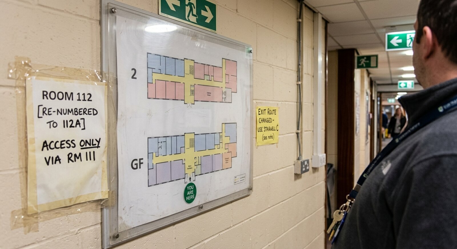
The everyday map tells a student where their lecture is. The same map, with one more layer, can show the route to the designated assembly point, the location of life-safety equipment, and which areas are closed right now. Closing a space should take seconds on a screen, not a printed notice and a roll of tape.
Digital maps can also help to give front-of-house and security staff their own version on a tablet, rather than a plan behind glass in the lobby. None of this is dramatic. It's operational hygiene, and it builds on the map you already have rather than being a separate purchase.
Nudging, not just directing
Routing can carry policy. For a one-floor trip to the busiest café, the map can suggest the stairs. During a large event, it can keep guest traffic out of teaching corridors.
Step-free routing is standard on nearly every map we build, so where the accessible route costs nothing extra it can simply be the default rather than the toggle. The people who run a building always know which routes they wish people would take. The map can quietly agree with them, without a single new sign going up.
Who owns it on Tuesday
Most campuses run several room-booking and timetabling systems at once, a directory that changes weekly, and a map that nobody is formally responsible for. A digital map forces a useful stakeholder conversation about ownership: what flows automatically from the systems you already have, what the operations team edits themselves, and what the supplier looks after.
That conversation usually ends somewhere reassuring: less integration than you feared, more ownership than you had. Very few institutions need to connect everything on day one, and most are relieved to hear it.
Start with a map, not a programme
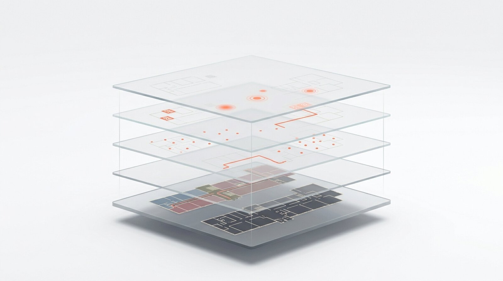
None of this has to happen at once. The sensible flow of a roll-out might be the implementation of a geographically accurate base map first, then wayfinding, then the additional layers (egress, booking integration, event overlays) as the institution is ready for them. The base is built once and reused; that way, nobody pays for mapping the building twice.
We've had these conversations many times, across university campuses, major hospitals, rail stations and museums. The buildings, countries and sectors differ; many of the questions, remarkably, don't.
If you're thinking about any of this for your own campus or estate and would rather talk it through in confidence first, we're happy to do that. Please just get in touch using our contact form, and one of our team will be in touch for a confidential conversation.
Request a demo
Experience the power of our mapping, wayfinding, and asset tracking technology for yourself. See how our software can enhance your facility.