Small icons, big decisions: what a map symbol has to do

Look at any good digital map and you will barely notice the icons. The little symbols for lifts, toilets, shops and exits do their job in a fraction of a second and let you get on with finding where you are going.
Getting to "barely noticeable" takes more thought than most people expect. At Living Map, the iconography is designed with the same care as the routing behind it, because a map is only as useful as it is understandable. We asked Makenzi Lelliott, one of the designers behind our maps, what actually goes into the smallest things on the screen.
What makes a map icon different from a normal app icon?
Map icons represent real places and real objects. People are using the map to find those things, so the icon has to depict what it stands for accurately, and users need to understand it at a glance, before they have interacted with it. Often they never interact with it at all.
They also have to do that while staying simple, because they are rarely on their own. A map icon sits among a whole set of other icons, so it needs to be clear while surrounded by everything else.
And they are designed with far more in mind than a static app icon. The map is built to be moved around, so the icons are rarely in the same position twice. Their size, their colour, whether they sit on a backing shape or not, where the label goes, all of that affects the hierarchy and whether the icon works in that space. It is the relationship between the icon and the other icons, and between the icon and the map as a whole. They are often working alongside the room colour or the wall colour, so they need to feel cohesive so that everything together shows the user what's what.
Users need to understand a map icon at a glance, before they've interacted with it. Often they never interact with it at all.
How much can one small icon actually communicate?
A surprising amount, almost instantly. A well-designed icon should show what something is, where it is, and how important it is. It can go further than that: whether something is accessible or limited, directions within the icon itself, sometimes specifics about what you can do at that place.
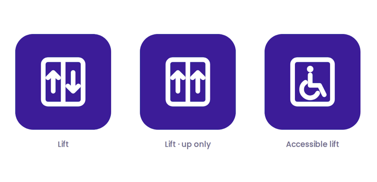
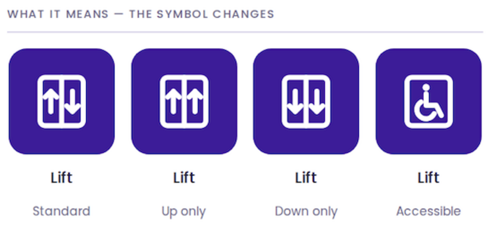
Take a lift. Through small variations, a lift icon can show whether it is a standard lift, whether it goes up only or down only, or whether it is an accessible lift suitable for wheelchair users.
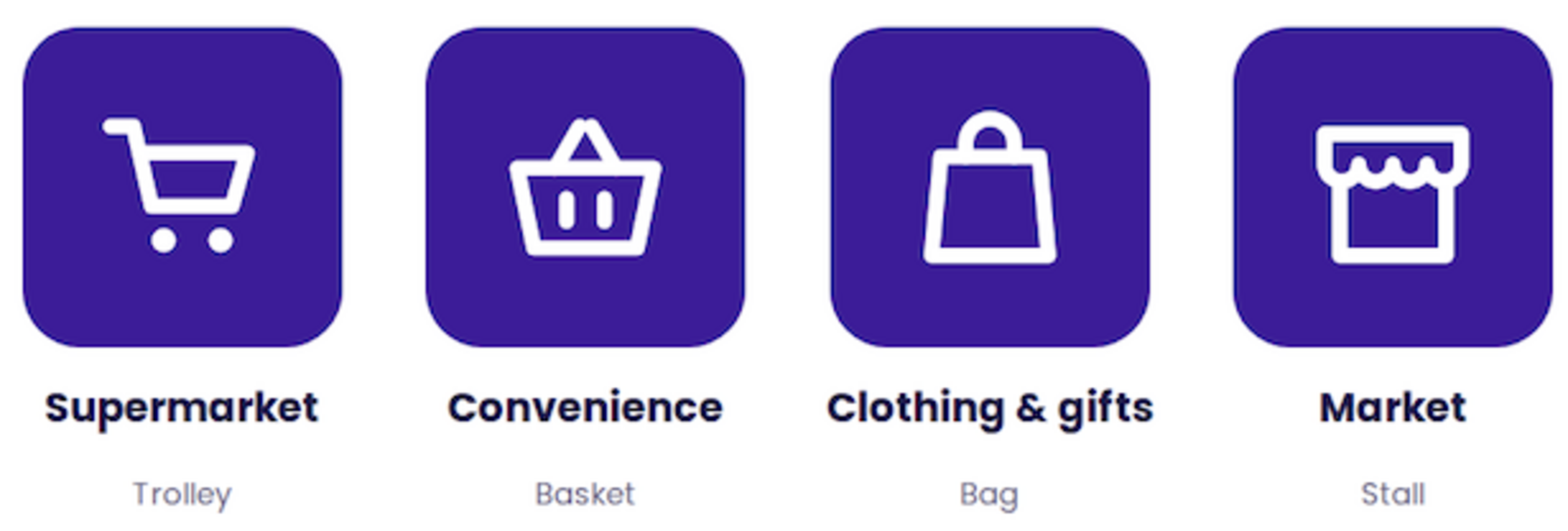
Or take our retail icons. They all say "shopping", but each one adds clarity about what kind. A trolley represents a supermarket. A basket represents a smaller convenience store. A shopping bag suggests a clothing or gift shop. A stall represents a market. And so on.
Colour does some of the work too. We use greens for emergency exits and red for medical and security, because those are associations people already carry from the real world.
Are the best icons usually the simplest?
In general, yes, as long as they still show what we need them to.
Because these icons are so small, they are designed on pixel grids so that no information gets lost. Design something too small, too fine, too detailed, or with a gap that is too narrow, and the detail disappears. Getting the proportions and spacing right is what makes sure that everything you want the icon to say actually comes across.
That same discipline is what makes an icon work for a quick glance rather than a proper look. The amount of detail, the simplicity, and the colours used all matter a great deal when someone only has a second.
Some symbols people get instantly and some are surprisingly hard. What is going on there?
Some symbols already have huge existing association. Toilet icons are used and understood worldwide, as is the wheelchair symbol or an aeroplane. We have seen them thousands of times in different settings, so we already know what they mean.
The less real-world association a symbol has, the less obvious it is.
When does an icon need a text label, and when doesn't it?
This is very much about the hierarchy we want on the map, and it differs greatly from map to map. Giving something a text label instantly makes it more prominent, and how the label is applied adds to that.
An icon without a label reads as less important, so it suits the things that most people are not looking for. In a shopping centre, the shops have text labels because the store name matters: the icon tells you it is a shop at first glance, and the name gives you the specifics. Other things on the same map might go unlabelled, like vending machines, toilets or cash points. Still important to show, just not the main focus.
Labels also give distinction between similar things. A shopping centre map has a lot of shops on it. The icon says "shop", the label says which one. There is no point in a row of shop icons leaving the user guessing what's what.
The icon and the label are designed to work together, not to duplicate each other. Put simply, a label earns its place when there are several similar places or facilities on the map that need telling apart, when the symbol might be less familiar to users, or when something needs to stand out more than the icons around it.
The icon and the label are designed to work together, not to duplicate each other.
Should icons change depending on the environment, say a hospital versus a shopping centre versus an airport?
Mainly it comes down to the hierarchy we want and what is most important on that map, and how the icons relate to the surrounding map. In a shopping centre the shop icons matter most. In a hospital it is the information and reception icons. In an airport it is the gates and security.
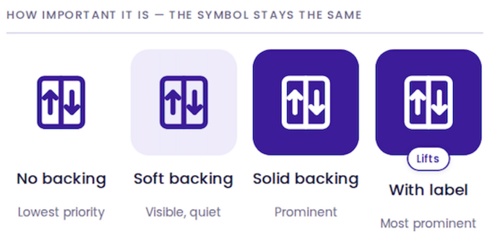
Whether an icon has a backing, what colour it is, whether it has a label, all of that feeds into how important it is deemed, so it changes per map.
What stays the same is what the icons portray. The symbols themselves keep a recognisable core shape, which feeds back into user association. How they are shown differs; what they mean does not.
What is different about designing an icon for a digital map rather than a printed one?
A digital map icon has to communicate inside an interactive environment that keeps changing. A printed map icon communicates inside a fixed one.
That changes a lot. Digital icons are viewed at multiple zoom levels, often at a smaller scale. They can carry interaction that reveals more information. The devices people view them on vary enormously in resolution and screen brightness, so they need to be designed to be accessible on most or all of them.
They are also competing far harder with other icons and map elements. An icon can be hidden if it overlaps another. At a low zoom level maybe only one icon and label is visible, and more appear as you zoom in. None of that happens on a static map.
The thinking is the product
The detail in this conversation is the point. Living Map's value is not only the platform, the routing and the data. It is the judgement applied to every small decision, right down to whether a lift icon has a backing shape, so that a complex place feels simple to the person standing in it.
Request a demo
Experience the power of our mapping, wayfinding, and asset tracking technology for yourself. See how our software can enhance your facility.